Most of the screen printers I’ve come across in the last few decades still think in “old school” terms when it comes to printing on dark or black substrates. They think a solid white ” bulletproof” layer of ink needs to be put down first. As if we were offset printing on white paper. This is a great way to kill the breathability of the cotton, create massive dot gain and make a plastic decal that will split and crack with repeated washing. Not to mention, use a boatload of white ink.
Being the rebellious, ignoramus I was back then, I had to ask…. why? To which I got a whole host of reasons and rationalizations or excuses :-O So, I set off to screw up some shirt orders in an effort to prove to myself why this was a necessity. The ensuing ” you’re WRONG” war with the printer, screen tech and production in whole was glorious, to say the least. My platform quickly changed from ” why not?” to “prove it!”
Here is some of what I have learned from the battle:
1.) People who think they know it all… learn very little!
2.) Under basing inks on dark garments can be a halftone or screen tint.
This can make the image more 3-D, keep the solid ink from cracking and keep the garment breathing better.
3) Under basing inks on dark garments can be a different color than white.
This is great when you have limited heads and a lot of color. Light colored inks might work best.
4) Under basing inks on dark garments can be a thin ink.
We do not need to block out the dark shirt just create a base for the ink to set up on rather then absorb into.
5.) Under basing with a thin white or gray and adjusting your highlight white to the brightest areas can create awesome mid-range detail.
6.) Trying a color that is not light or bright can have unique and beautiful results.
7.) Experimenting is like a box of chocolates…………
8.) The phrase ” they’re only t-shirts” can have a profound effect.
9.) Art is subjective! What some people call wrong, can be beautiful to others.
Case in point… Here is a job we ran today. Our client could only afford three set-ups and prints…. and it’s not enough shirts to add additional color just to do a great job.
The lobster on the course is red not blue and the mountains look terrible in red. The text needs to be white or at most, bright. This only leaves one more color.
And typically we under-base the white so as not to have to print- flash-print every color. With gray, as mentioned above, it looks very 3-D, but is lacking color contrast and interest
as it just looks red and white. So….. I know, lets print a blue under-base??????
Here are the 8×10 Glossies….. alright they’re 2 megapixle iphone shots.
Here is the base blue……….
Blue under base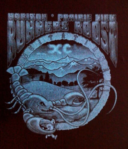
Now I thought that flashing it would help the next colors from absorbing into the garment and getting toned down with black. Also I thought that, because plastisol does not like to stick to itself wet, the next colors would be muted.
However, here is what happened,,,,,, printing the white second on the wet blue base blended the fades and halftones much more smoothly. The passover from the red also helped the inks merge and blend. However, it also lifted the brighness of the wet white.
But since we did not need to flash, we simply reprinted the white last with a quick light pass.
Here it is with white next on wet blue.

Blue with white
and here is the finished print.
Final print
Topics:Screen printing 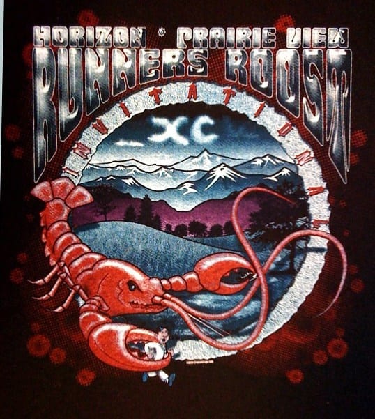
Can you go more in depth on the process that you took to make this print? Did you print wet on wet? What software did you use to create the halftones? How do you get the paint to mix to create the purple in the sunset?
Thank You